Reports
Contents
Configuring Reports
DreamFactory Enterprise uses the ELK stack (Elasticsearch, Logstash, Kibana) for reporting. API calls from instances are automatically logged by the ELK stack, and Kibana can be used as an user-friendly and flexible tool to visualize the metrics.
Introduction to Kibana
Go to the Kibana URL in your DreamFactory Enterprise installation. Usually the URL is http://kibana.subdomain.your-domain.com. Make sure to add the URL in the .env file, located in the root folder:
<source lang="bash">
DFE_AUDIT_CLIENT_HOST=http://kibana.subdomain.your-domain.com
DFE_AUDIT_CLIENT_PORT=5601
</source>
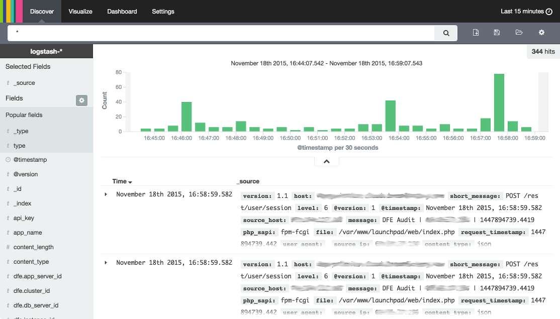
The Discover tab shows the latest API calls, the parameters indexed, and a bar chart with total API calls for the selected time period. You can filter the data based on the indexed parameters on the left side. This method is useful for getting a detailed view of the data.
Use the Visualize tab to view API calls as line charts, bar charts, pie charts, etc. Select types and filters for X and Y axes to present the data in the preferred way. You can save each visualization, including the selected filters, and open each visualization again later.
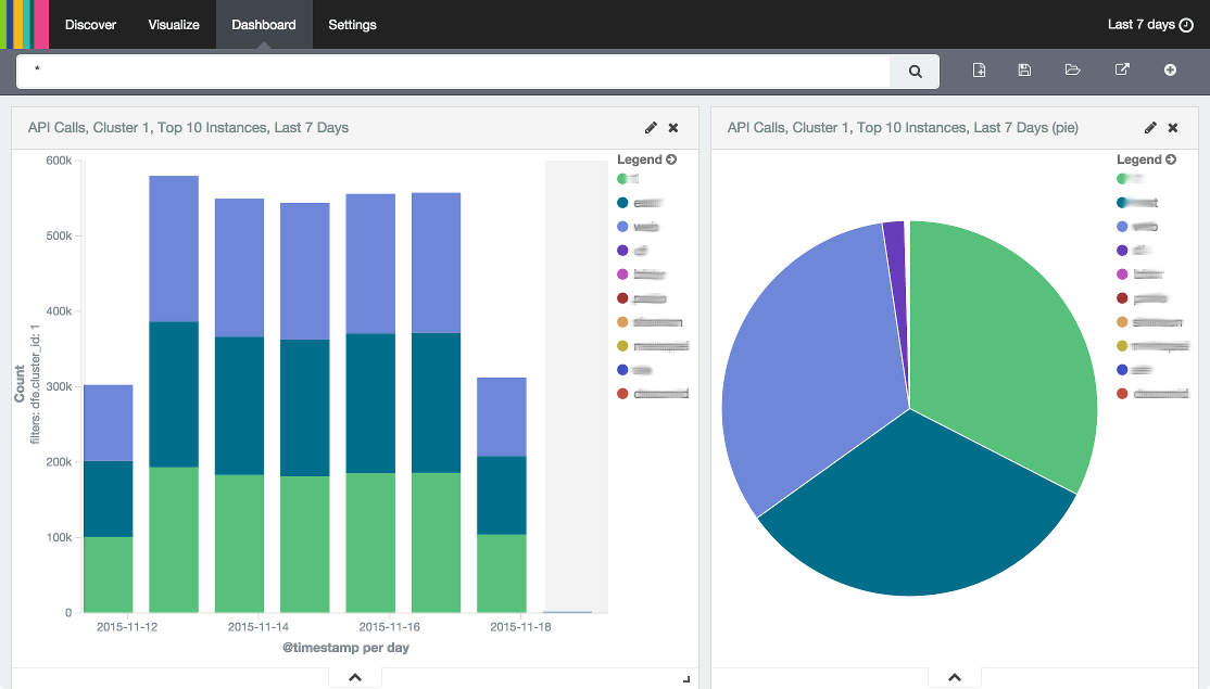
A dashboard is collection of visualizations. You can easily insert your saved visualizations into a dashboard. You can have as many dashboards as you want and each dashboard provides an easy way to present multiple charts on the same screen.
Create New Dashboard
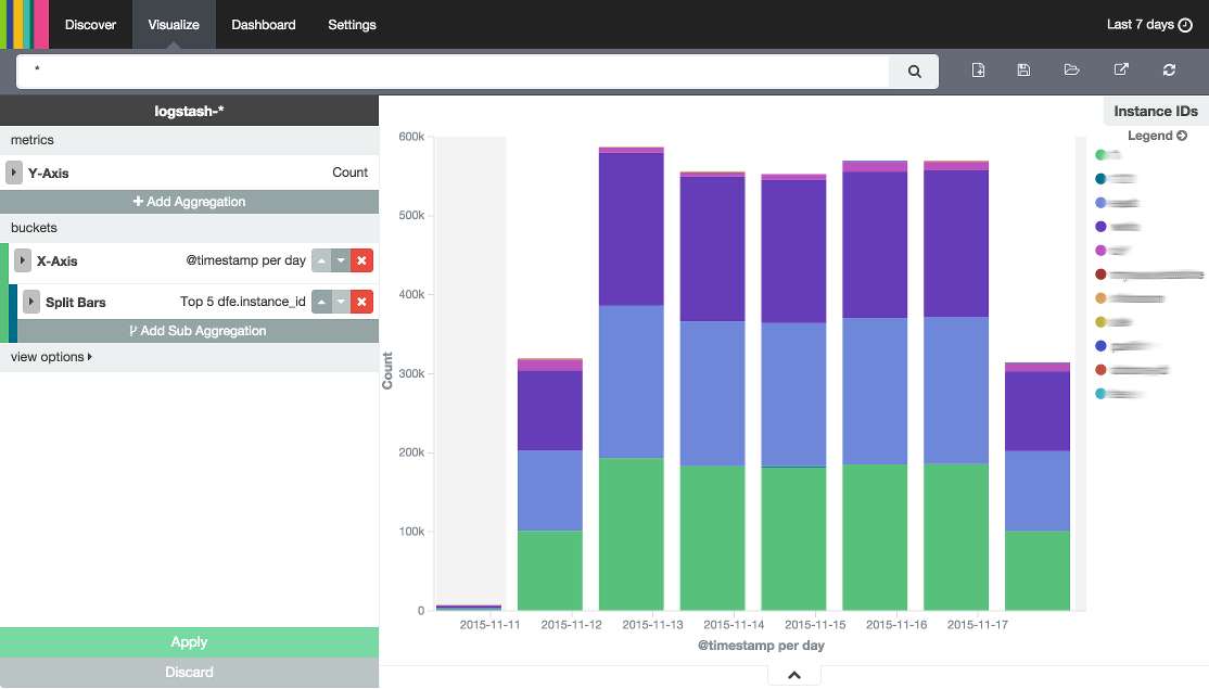
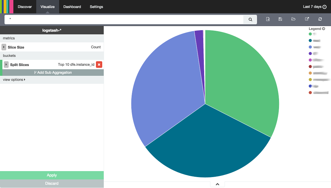
The following section shows how to create a simple dashboard with two charts, a bar chart and a pie chart. Both charts show the Top 10 most active instances. The bar chart is a stacked bar chart showing daily API calls grouped by the Top 10 instances, and the pie chart shows how the API calls are distributed between the Top 10 instances.
Create Visualization
Follow these steps to create a new visualization (bar chart):
- Go to Visualize and choose "Vertical bar chart".
- Choose “From a new search” as a new search source.
- A bar chart without any filters will be shown. By default, the last 15 minutes is shown. Expand the timespan selection by clicking the link in the very top right corner of the screen (where the default timespan "Last 15 minutes" is shown), and choose “Last 7 days”. Collapse the timespan selection again.
- The Y-axis is Count by default, no change needed.
- Start setting up the X-axis filter by choosing X-axis as bucket type in the left side of the screen.
- Choose “Date Histogram” as aggregation, @timestamp as field, and Daily as interval. Click Apply in the lower left to update the chart, which now will show total daily API calls across all instances.
- Click Add Sub Aggregation to add another aggregation.
- Choose “Split Bars” as bucket type, and “Terms” as sub aggregation.
- Choose “dfe.instance_id” under String, choose “Top” as Order, and set Size to 10. Click Apply to update the chart.
- Click the Save Visualization icon in the top right menu, give your chart a title, and click Save. Your visualization is now saved and you can add it to any dashboard.
Creating a pie chart is very similar:
- Go to Visualize and choose “Pie chart”.
- Choose “From a new search” as a new search source.
- A pie chart without any filters will be shown. By default, the last 15 minutes is shown. Expand the timespan selection by clicking the link in the very top right corner of the screen (where the default timespan "Last 15 minutes" is shown), and choose “Last 7 days”. Collapse the timespan selection again.
- The Slice Size is Count by default, no change needed.
- Start setting up the slices by choosing Split Slices as bucket type on the left side of the screen.
- Choose “Terms” as aggregation.
- Choose “dfe.instance_id” under String, choose “Top” as Order, and set Size to 10. Click Apply to update the chart, which now shows how API calls are distributed between instances.
- Click the Save Visualization icon in the top right menu, give your chart a title, and click Save. Your visualization is now saved and you can add it to any dashboard.
Create Dashboard
You can now add the two visualizations (charts) to a dashboard. Follow these steps to create a new dashboard:
- Go to Dashboard.
- Click the + icon (Add Visualization) in the top menu.
- Select one or multiple visualizations (charts), in this case the bar chart and pie chart you just created.
- Drag and resize the visualizations to position them.
- Click the Save Dashboard icon in the upper right of the top menu, give your dashboard a title, and click Save. You can now open your dashboard again at any time.
Embed
All the settings are stored as URL parameters, so it's easy to embed and share your visualizations and dashboards. Click the Share icon in the top right menu to get a link and HTML iframe script for embedding.
If the charts are embedded, the top menu etc. will not be visible. The menu and other controls are hidden by adding “embed” as a URL parameter.
Security
Kibana is not protected by default and can be used by anyone with the URL. It is highly recommended to password protect Kibana. A good way is to add web server authentication for the URL in the web server configuration files. See the following examples.
NGINX
<source lang="bash"> auth_basic ”Restricted”; auth_basic_user_file /etc/nginx/conf.d/kibana.fabric.htpasswd; </source>
Apache
<source lang="bash">
AuthType Basic
AuthName “Restricted”
AuthUserFile /var/www/..../.htpasswd-private
Require valid-user
</source>
This will force user authentication and the user will be prompted for a username and password.
Authentication may be different for other web servers.


